I listened to Cory Booker for a short while before my doctor’s appointment and then for a good long while later, stitching in the afternoon sun. I’m noticing how much better I feel. I’m noticing how much it matters for people in power to speak up.
Got quite a few “finishers” in the works. Antidotes to despair I suppose. Medicine against feeling powerless. One stitch at a time.
Trimming, binding, signing, and adding dowel sleeves. It always takes longer than I think.
Here are examples (below) from four recent series of digital collages. Almost all incorporate paper collage or photos of my own. If I weren’t feeling tongue-tied by national events I might have something to say about them but they can speak for themselves I guess.
Heat dome: We walked Finn late, early or not at allFloors are cooler than rugsEchinacea coming earlyAstilbe adds pink notes to the phase of yellowScrap happy, as they sayRule: use only precut stripsWhat even is this?And why laboriously hand quilt along pattern lines when it barely “shows”?Daisy flea bane and rudbeckia going wild. I did not plant either. Glad it’s over
This is one of many Middle Passage quilts that I’ve made over the years. I began it a long time ago (2013?) while reading about the transatlantic slave trade but didn’t bind it until last week.
All the usual reasons for delay pertained, prime among them that I am a better starter than finisher. I lose track. Things pile up. But also this: early on a reader of this blog suggested that I was not “staying in my lane.”
All these years later, I say fuck that. Not fuck her, but fuck that. Fuck that. (Cultural appropriation discussed in part here and here and again here).
I will never tell Black women what to think or how to feel, but it certainly matters to me that learning about the history of slavery has made me a more informed, more sensitive person. A better citizen, a better reader of novels, a better writer, a stronger and more informed consumer of American culture and politics.
Before continuing, I have to thank the cadre of readers here, mostly older white women like myself, who have let me know over the years that what I share about American history and race is meaningful to them. It’s not that I set out to teach per se, but by sharing what I’m learning and having you along for the ride, the learning gets amplified and transforms what would otherwise be a solitary process into a communal one. It really matters to me. YOU really matter to me.
I like quilts to stand on their own, leaving interpretations up to the viewer but I thought in this case it might enhance the experience of looking if I were to explain the visual connections between fabric choices and the Middle Passage. So here goes.
The triangular shapes refer to sails. I suppose they could also refer to the triangular shape of the trading routes but I didn’t think of that until just now.
Adapted from History Crunch website
Swatches of indigo, bubble motifs, fish prints, and a black swirly-spiral print call to mind the Atlantic Ocean.
The half-circle black and silver print (at the bottom, above) looks African to me. The black and deep green hand-dyed swatch IS African.
The inclusion of a map print refers to the shores at either end of the Middle Passage — say, Sierra Leone on one side and Charleston on the other.
The brown stripes and the green lozenges both refer to the ship itself. The brown stripe is suggestive of the planks, while the green lozenges call to mind those illustrations that depicted Black bodies packed in the hold below deck.
One reason it’s important to focus on the Middle Passage now and again is because the number of people who died en route is often overlooked when relating the costs of slavery. It’s a huge number.
A conservative estimate puts lives lost en route at 1.8 to 2 million. Another 1.8 million died while housed in the barracoons awaiting transport. Another 1.5 million died during the first year of laboring here.
So one way to look at this is — roughly 14 million Africans were kidnapped to yield 9 million slaves.*
It is hard to wrap one’s mind around these numbers.
My photo from the Lynching Memorial in Montgomery
Check out the Equal Justice Initiative’s website — it highlights, among other things, the lesser known slave-practices and sources of slave-related profit in New England.
Below is another Middle Passage quilt. You’ll notice many of the fabrics are the same.
I’ve linked to these novel-adjacent pages before, but here again is a kind of warm up exercise done in the style of Colum McCann and describing the Middle Passage. It’s called Water Was.
* these figures and the framing of the figures came from a documentary I was watching about a week ago. I tried to back track and figure out what it was. No luck. If I do, I’ll come back with attribution.
I used to work bigger more often. This smallish tower quilt was getting a rest pinned to the back of another quilt and I decided, after looking at it for a day, that I liked it with a surround of brown.
I went looking downstairs, fully expecting to have to make a substituon, but I found the very cloth!
Bigger surround wd allow yellow roof. Yeah or nay?
It is going to be hot today. Dog walk was sweaty. K has his five-year colonoscopy midday and of course he needs a ride. Because of the Covid numbers, I will wait outside. Hope there’s a patch of shade.
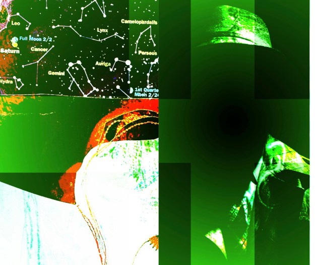
And below find yesterday’s collage results (some of them). Feel free to skip if you’re on Instagram!
This is Paris Collage Collective visual prompt for the weekThis one is not a part of the series Look for the fedora. It represents the rise of theocratic surveillance. The birth collage speaks for itself I hope. Original birth collage made in 90’s, when I was, you know, giving birth. One of the weird residual attitudes of having been raised Catholic is a lasting affection for all things Mary. In my universe, she is allied with the Divine Feminine and not Christianity. Mary’s hand is a helping hand. Yes, that’s Jeremy Irons. One layer here is another paper collage featuring the actor and paper doll losing her head.